
Building a Responsive Website design: In today’s new age world as a business we cannot afford to limit our websites to computer screens alone. Not only are all computer screens various sizes but each user can adjust there own settings that can make your website look completly different that your initial intentions.
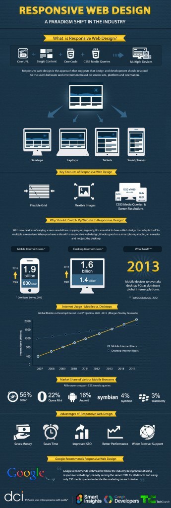
As technology advances more and more people view consumer websites on there mobile phones, tablet’s and e-readers. Building a dedicated website for each of these devices would not only be a cumbersome project but would also drive up the cost of your website development. Based on recent statistics, mobile Internet usage has been growing over the past few years and is expected to overtake computer Internet usage by next year!
The Solution – Responsive Website Design
Responsive website design is a way of building a site using a set of standards that adapt to the size of the screen the website is being viewed on. What appears to be a full scale website on a desktop computer when viewed on a mobile device will display as if it was built specifically for that device by scaling down the page elements such as images, boxed areas, and menu’s while maintaining the text to a readable size on the mobile device. This process works the same way across all different types of devices no matter what the size of the screen.
Making sure to build your companies website with a responsive framework when you start your planning and developing of your new website will not only save you time and money, but will also ensure your site will be available to viewers for the future as well.
